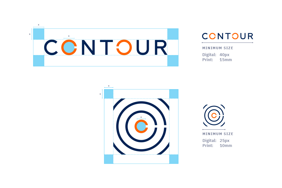
The Contour Logos are to be used in its entirety in the format and proportion shown on this guideline page. It provides the standards for the use of the Contour Logos and guidelines for various materials.
Wordmark
This is our most important asset. It should be used on all print materials and digital platforms. The cuts in the ‘O’s are inspired by the idea of point-to-point connectivity and networks. The counters in the ‘O’s represent the start and end of connections.
Logomark
After the wordmark, the logomark is the most important asset. The cuts from the wordmark carry through into the logomark. Repetitive contour lines emphasise the idea of point-to-point connectivity and networks.
Free Space Specifications
To ensure legibility and consistency, ensure that the wordmark is kept within the specified free space measurements. The wordmark should never be smaller than 40px on digital and 15mm on print. The logomark should never be smaller than 25px on digital and 10mm on print.
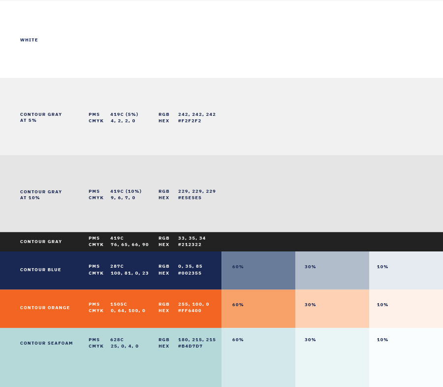
Colour Palette
Logomark: After the wordmark, the logomark is the most important asset. The cuts from the wordmark carry through into the logomark. Repetitive contour lines emphasise the idea of point-to-point connectivity and networks.